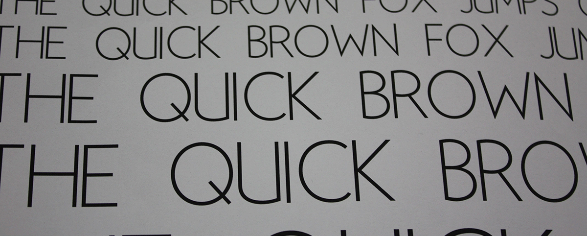
Many writers do not consider the potential impact of document design. When popular programs such as Microsoft Word pre-select font and formatting options, writers may overlook these choices. However, ensuring an effective design can be a difficult task. How can you make sure that your handout, syllabus, resume, or CV is easy to read and communicates your desired message? Even the smallest decisions have consequences: font choice, font size, font color, paper orientation (portrait or landscape), organizing information by rows or columns, use and placement of images, etc.
The following sections provide an overview of Processes, Tips, Tools, and Resources for working with document design.
Getting Started
What kind of document are you designing? How are you going to deliver information? Almost any project can benefit from knowing more about document design. The type of project you are designing will help you determine the software you will want to use. If you are designing a text-heavy document, such as a resume or handout, you will probably want to use a word processing program such as Word or Pages. For a flyer or other project emphasizing images, you might consider Adobe’s InDesign or Microsoft’s Publisher.
In-Progress
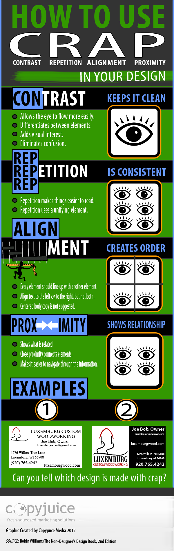
As you craft your document, knowing about principles of design will help you effectively communicate your message. The CRAP principles are contrast, repetition, alignment, and proximity:
- Contrast: Try “to avoid elements on the pages that are merely similar. If the elements [like type, color, and size] are not the same, make them very different.”
- Repetition: “Repeat visual elements of the design throughout the piece. You can repeat color, shape, texture, spatial relationships, line thickness, sizes, etc. This helps develop the organization and strengthens the unity.”
- Alignment: “Nothing should be placed on the page arbitrarily. Every element should have some visual connection with another element on the page. This creates a clean, sophisticated, fresh look.”
- Proximity: “Items relating to each other should be grouped close together. When several items are in close proximity to each other, they become one visual unit rather than several disparate units. This helps organize information and reduces clutter.”
Source: Robin Williams’ The Non-Designer’s Design Book (1994).
Finishing Up
Will you be printing a physical copy of your document, or will your audience view the document on a computer screen? This decision will determine whether you need to use high-definition images (for printed documents) or whether you need to optimize images for web publishing.
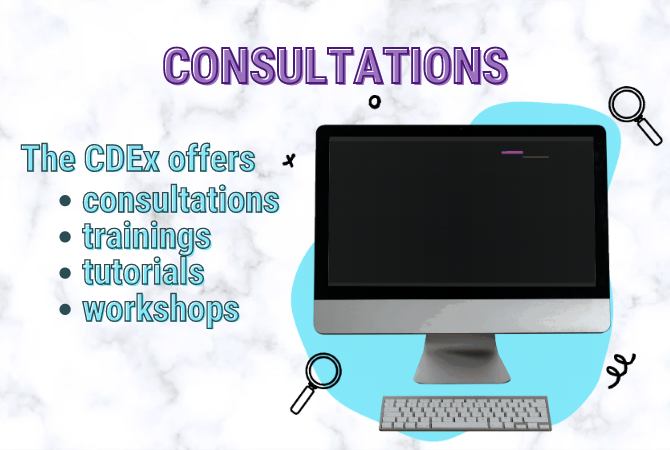
The best way to know if your design is effective is to share your document and get feedback. Print a draft of your document or email it to a friend. You can also get advice at the CDEx.
- “Design Principles” (requires a free Adobe ID to view content) – (from the website) “Designers use design principles to evaluate and inform the consistency and visual hierarchy of their design. Put into action, design and typographic principles, can then be used to make sure designs reach an intended target audience and/or meet the goals of a company or individual. Use this activity to introduce how to use design principles and typography so students can evaluate and inform their designs.”
- “Effective Print Document Design” – A thorough introduction to designing print documents.
- “The Big Four: Contrast, Repetition, Alignment, Proximity” – More information about the CRAP principles from chapter six of Presentation Zen: Simple Ideas on Presentation Design and Delivery by Garr Reynolds.
- “How to Use CRAP in Your Design” Infographic – A well-designed infographic about the CRAP principles from CopyJuice.com. (Pictured on the right)
- “Document Design Tips” from Simply Put – Keep it simple!
- The ABCs of Visual Design – A blog by Donna Tersiisky that teaches basic design principles and offers examples and exercises. A useful tool for learning and teaching design in new media.
- The Gestalt Principles –Concise page that discusses Gestalt Principles and provides examples.
- Some Ideas about Composition and Design Elements, Principles, and Visual Effects (2012) by Marvin Bartel – Shows how to teach basic design elements to students. The design of the page itself reinforces the principles taught. Very useful source for students and teachers.
- “Good Handout Design: How to Make Sure Your Students Are Actually Learning From Your Lecture Notes” by Anna Johnson (Mt. Hood Community College) – A resource for teachers on handout design.
Another way to think about document design is through information design. This term, familiar to graphic designers, emphasizes that designers should convey information both efficiently (by avoiding unnecessary elements) and effectively (by conveying a purpose or persuading an audience).
Design consultant Terry Irwin further explains the concept in “Information Design: What is it and Who does it?” (available as a PDF download).
Software
- Microsoft Word is the most popular program for document design projects. Even though Word makes default decisions for writers, such as font and margin size, you don’t have to use the default. Download the CDEx’s “Document Design w/MS Word” (PDF) by Melanie Kill and Curt Rode for design tips with MS Word.
- Pages – Apple provides a detailed tutorial for Pages, their version of Word.
- Adobe InDesign – InDesign gives users the most freedom in terms of document design choices. InDesign works best with image-heavy projects, such as flyers or brochures.
Tutorials
- Indesign Basics by CDEx
- “How To Get Started With Adobe InDesign CS6 – 10 Things Beginners Want To Know” by Terry White
- Microsoft Publisher’s “Publisher Quick Start” – Though Publisher does not provide as much freedom as InDesign, it is another option for designing documents that use a lot of images.